Wednesday, April 18, 2007

My seven year old Grandson in Wales showed me some of his work. He has put together a portfolio for me to look at. I must admit to being quite impressed. This first image is of his home and the back garden. The garden is an elongated affair and at the time of drawing had a pile of large logs at its far end.
This next one shows a flower of some sort. He told me it is a venus Flytrap. It does resemble one. He drew it from memory after visiting and exotic park. I think he has a good eye for form for his age range.
Most striking, is this drawing of a dinosaur. (He has done lots of drawings of various dinosaurs. He is rather "in" to them just now.) This drawing is remarkably accurate when compared with the original illustration he worked from and featured below.
This illustration is from the "Collins Book of Dinosaurs" published by Harper Collins.

Like my grand-daughter featured on Jan 28, he too has artistic ambitions. I find that most encouraging. Perhaps its a sign of the times. If there is an active artist in the family, the younger element seem more encouraged. I can remeber my childhood when drawing was actively discouraged as time wasting, both at school and at home. All I wanted to do was draw, - anything.

Tuesday, April 10, 2007

Cornish Engine House. Done in 2003 and as the note says, it is a composite. As I recall, I was on a bus along by Zennor and Pendeen way and we passed several of these ruined buildings. It was a good excercise in speed drawing but I didn't have to try too hard to remember what I'd seen as successive engine houses hove into view. They are dotted all over western Cornwall.
In a way I suppose you could say, "When you've seen one, you've seen 'em all." But you can say that about a lot of things. Whatever, this image is somewhat evocative I think. A sort of snapshot.

Saturday, April 07, 2007

Rooftop study done along with the previous Slaidburn drawing shown earlier. This one turned up in an old sketchbook from 2003. I was having a bit of a "ratch" (Cumbrian word) through some old stuff when this one turned up. That period in Slaidburn Youth Hostel was a one of long hot lazy summer days with good light that clearly picked out every detail. Again, the tinting was done in cold tea. You can just about visualise it, sitting there in the sun with a cup of tea, drawing this and geting absorbed in the activity of drawing. My teas goes cold. Can't waste good tea... use it as a drawing medium.

Sunday, April 01, 2007


This little drawing was done some three years or so ago while I was wardening a youth hostel in Slaidburn, near Clitheroe in Lancashire. "Slaiburn" which is the title of this piece is a real olde worlde type of village. The view from the back window which is only about a foot of so square, if that, is of old roofs and chimneys. It was asking to be drawn. I did this in watersoluble pencil and afterwards applied a wash of cold tea. No wash was applied to the window frame so as to preserve the original whiteness of the paintwork. The use of unconventional materials, like cold tea, wine dregs and whatever else is to hand at the time can create interesting effects. It probably doesn't show up too well here but cold tea is rather like water colour raw umber. Is there a tannin pigment I wonder?

Sunday, March 25, 2007


Another version of the patch of shingle featured earlier. As I hinted, I have drawn this using a Rotring pen. The technique is tighter definitely. What is also interesting is the way these objects seem to have something of an organic element to them.

Wednesday, March 21, 2007

" Shingle Drawing" - for want of a better title. 27 x 27 cm pencil drawing on pre-tinted Bockingford paper, 250 gsm. I laid down a watercolour wash and after it had dried I drew on it using 8B watersoluble pencil on the coloured area and washed it in and a 6B normal pencil on the rest. I worked from a photograph I took on a beach in Corfu some two years ago.
What is interesting is what arises during the drawing process. The first part of the actual drawing involved setting down the contours of the individual pebbles. In a way I would have liked to have stopped there. But the original concept was to arrive at some sort of photorealistic image but at the same time have part of the work with the colour bleached out to highlight the drawing element of the work. I think I have managed that to some degree where it is full colour at one end and monochrome (B&W) at the other.
However, I think I will be doing another version of this showing contour only. I shall probably do the initial contour drawing in pencil and finish with an ink drawing using a [Rotring] technical pen. It seems to demand a technical drawing element. Certainly calling for a somewhat tight technique. What do you think?

Monday, March 05, 2007


New drawing taken from a fashion photo. There is some retouching of the dark area to the left of the upheld finger done with photoshop. The dark area is as intense as this but the black graphite surface, being smooth, reflects the light giving it a silvery appearance when photographed.
Image is A4 size on paper at A3 size, 180gsm. Drawn throughout in soft graphite. No charcoal used. This whole picture is simply an exercise.

Monday, February 26, 2007


"Life's a Beach." Exhibition now up and running. Eleven pieces on show made up of groups of 10 x 10 cm squares either in multiples of four or five. All the work features the sea or the shoreline.

Saturday, February 24, 2007


"Atlantic Drawing". A graphite drawing on four 10 x 10 cm panels mounted on a 20 x 60 cm board. The density of the graphite varies. The most dense image is on the left and the lightest on the right. Unfortunately this subtlety is not so apparent in the image shown here. This work will feature in "Life's a Beach", my exhibition in Lancaster throughout March.

Monday, February 19, 2007


"Tintagel". The finished painting was done from an original drawing done on site last August. The image here has had a vertical column cut from the drawing and that column split into five separate components which I have since manipulate with photoshop to get some idea how it will turn out. This image was printed then used as a reference for the finished painting.

There's more comment about the upcoming show which you can read about on the other Blog.

Needless to say that as the deadline gets ever nearer, a proportional increase in controlled panic sets in. "Life's a Beach" opens on Tuesday Feb. 27 at 7-30pm. I hang the show on Monday.

Thursday, February 15, 2007


Shingle Drawing.

Much of my studio stuff is still in storage. I have managed to complete some eight peices for my upcoming exhibition, some examples I have already posted, but was hoping to put in a couple of triptych's too. But when I looked at the stored stuff all in sealed boxes, which did have our respective names on, there is no knowing what is in which box. I could strike lucky and find what I am looking for on opening the first box, or I could be on a week opening boxes. I gave up. I need about ten pieces for the show. I have eight ready. Just have to make another two.

None of this has anything to do with the drawing posted here. This is a pen and wash design for a card based on some of the beach studies I have made over this last year. I still like to play with tone. The stones run from grey to green while the background runs in the opposite direction.

It makes for an interesting design I think.

Friday, February 09, 2007

The current images you can see on the flickr badge on the left are taken from one of my Cyprus sketchbooks. Apart from the core work of the Mediterranean shore I took a look at Cypriot culture and its ancient origins. Indeed many of the Cypriot artists I met draw their inspiration from these sources. Much of this work of mine is purely experimental.
The poses shown here were taken from life drawing sessions at CYCA from which I later "clothed" them to make this composite Gynekon scene.

Thursday, February 08, 2007


"Atlantic #6" Another not on show.This mixed media work was drawn on paper previosly given a random blue watercolour wash after which soft graphite and black ink was used. The preliminary sketches were essentially very quickly done. Porthmeor Beach at St. Ives in a December gale doesn't encourage one to linger. I took a photograph from which I did most of the work before quickly retiring to the warmth of the Tate Gallery Cafe.

Wednesday, February 07, 2007


"Atlantic #1" This will not be in my forthcoming show at the end of February as it won't be framed in time along with another five, "Atlantics #2 through #5" which I will subsequently post over the next few days.

This one is pure drawing using pencil only. As usual with this series the frames are 10 x 10 cm each.

Tuesday, February 06, 2007

"Life is a Beach." That's the title of my upcoming exhibition at the LUDUS Dance Centre's Foyer Gallery in Lancaster. It will run from Feb 26 through to April 2. I am still preparing work for this show of paintings similar to the drawing shown here. This is one of the preliminary drawings for "Sands". Each square is 10 x 10 cms. As I've [probably] mentioned before, these imiges explore the photographic concepts where some are in monochrome and others in colour and I try to show the transition twixt the two. Each frame is meant to be a progression not only through colour and form but serves to illustrate transition through the physical landscape.

Wednesday, January 31, 2007


Artemis. Definitely the women's goddess. Were she revered today I have no doubt she would be the patron goddess of the feminist movement. Protector of women, upholder of female chastity and honour, patron deity of the Amazons of Ephesus, goddess of the Moon, protector of the wild places, (she has my support in that one). But us men need to beware in her presence. She'd kill you as soon as look at you. Just think of what happened to poor Aktaion who stumbled on her skinny-dipping in a Grecian glade. Find out more on Wikipedia.
Anyway, - the drawing. This is copied from a colour photo of the statue on display at a museum in Athens. It is in almost perfect condition: only the hands are missing. Traces of the original paint remain on the hair. Archeological evidence suggests statues were painted in lifelike colours at the time and much of the paint has eroded away with time. Consequently we look at these works in a rather monochrome way. The viridian and red oxide on the statue is probably from time and weathering, - or is it? In a way it looks as if it was meant to be that way. An interesting piece of surmise and conjecture. Drawn on A3 size 180 gsm cartridge paper with various media. It was an enjoyable piece to draw.

Tuesday, January 30, 2007


"Fade" is a large-ish work, 100 x 70 cms drawn entirely with pencils. That is, not graphite sticks or other blocking-in agent except for the central tree which has had some water colour wash added. The work is part of my forest series based on the Northumberland/Border Forest Park. The scene is in a particularly dense part of the forest where the mist can linger all day even when the sun does break through and pick out individual trees.

Sunday, January 28, 2007

My eight year old grand-daughter paid us a visit over the week end (along with Mum and Dad I hasten to add). This morning, Sunday, as we walked through the park, she announced she would like to be a fashion designer. At the moment she is very keen on ballet and has attended classes for some time now. However, at the end of the walk, when we got back to my place she sat down with some photocopy paper, borrowed a few graphite sticks [HB, 4B and 9B} and produced the above image. What is remarkable is she was using this media for the first time.


Afterwards, I demonstated colour mixing and she produced this face image using water colour which I believe is also first time. She told me she has poster [tempera] colour at home.
She worked with a resricted pallette; Prussian Blue, Viridian, Red Oxide and Yellow Ochre.
It'll be interesting to see how she develops in a year or so.

Saturday, January 27, 2007

"Priestess" painted by Bouguereau in the 19# century. At first sight it looked like a typical grecian style woman. As part of this current project I did a copy of it.

I liked the flowing lines of the garments but, in the light of what I've seen on statuary of the period and bearing in mind this dress would be worn on a daily basis I wondered if it was very practical. The chiton certainly seems to have been a practical garment; it hardly changed in style for a millenium. I did rather wonder about the huge swathe of cloth about the midriff and the seeming lack of support for the breasts. (Bras are a much more recent invention).


Undaunted, I developed the contour drawing into a tonal work and came to the conclusion that this was a fanciful idea of the artist.

Fron this I changed the garb a little to more closely resemble that worn by such images as Hera, Artemis, Athene, etc. Perhaps I was trying to move away from 19# century/Victoria romatic idealism?

Images by Alma Tadema might also be worth a look. But then I think greek statuary and vase decoration will probably have a better provenance.

Tuesday, January 23, 2007

Nike of Samothrace. The headless sculpture in the Louvre, Paris; a long way from Samothiki whence it came. What I like about the image is the way the figure's clothing sways and the folds forming around it. Greek Art has a B.C. history as long as, if not longer than our own western European post-Christian period.
I've had to use some imagination here. How were the head and arms configured? What remains of the statue and what it represents suggests a victorious gesture hence the ghosted in head thrown back and arms outstretched.
This image is A3 size graphite drawing with red oxide wash.
I have just about filled a sketchbook with draped images of "ancient grecian" women taken from various sources. I'll post a few more of them anon.

Monday, January 22, 2007


I didn't spend my entire time during my last sojourn in Cyprus solely drawing the sea. I did spend some time looking at parts of the old town such as this arch in the Turkish Quarter of Limassol. As is usual with me I tend to pre-colour the paper. With marine drawings it tendes to be blue but here I have used yellow ochre, red oxide and viridian green. I did wonder why this seemed the most natural colouring to use until I realised that most of the Cypriot folk art tends to use these [colours] or a combination of them. Sure enough, on field trips I discovered these pigments are readily available. Red oxide from an area to the east of Limassol, yellow ochre from Pafos and the viridian from the vurdigris of the copper belt.
These pigments are often seen in the glazes on Cypriot pottery.

Sunday, January 21, 2007


A ready-made still life. The objects were in no way contrived. A shackle and two links attached to an eyelet cemented into stonework at St. George's Quay on the banks of the River Lune in Lancaster. The whole composition made for a very interesting study. Dawn in 3B, and 6B pencil.

Saturday, January 20, 2007


Wet cobbles in a Lancaster back street. Very appropriate for this time of year. Sorry about the long absence. My last computer died. But a brand spanking new one has me up and running once again.
This drawing was, as can be seen, drawn some time ago in January 2004. We sometimes travel miles on "art trips" for miles and miles looking for something to draw, and there it is, right under our feet. Literally at the bottom of my back yard.
Having said that, it won't stop me from going to the Eastern Mediterranean again.

Sunday, November 19, 2006

Cyprus Goddess


Cy Goddess, originally uploaded by Wulfric.

Probably not one of my best drawings but while here in Cyprus i have indulged a little bit of artistic anarchy. This image was drawn while exploring the Aphrodite myth, not surprising I suppose. A common technique among modern Cypriot artists is to lay down colour as a background then to draw over this. Much of Cypriot art is reminiscent of Marc Chagall.
Cypriot tastes tend towards painting rather than drawing. So it comes as no surprise to find a strong painterly aspect in most of the work.

Friday, November 17, 2006

Aphrodite is a small project I have completed here in Cyprus.I have run a feature on my other Blog. Quite frankly the whole thing started as a joke but as these things do, it developed into something more serious. Using the Paphos statue as a starting point I then went on to upstage Botticelli's famous Birth of Aphrodite by portraying her in a wet tee shirt. The above image is a study in gouache exploring this idea.

Drawing of the Paphos Aphrodite in the Cyprus Museum, Nicosia.

Wednesday, November 08, 2006


Two images from the current Cyprus sketchbook. Detailed drawings of the pebbles on the beach. I spend long hours watch/observing the sea before drawing it. The constant shift in tempo requires concentration. Waves tend to follow a repeat pattern. Sailors reckon on every seventh wave repeating. It is about right. But the trick is not so much to draw an individual wave but to capture the ebb and flow.

Wednesday, October 25, 2006

Another small drawing experiment alongside the main project. It is of a group of stones under the water at a beach in Limassol. Each horizontal series is a different interpretation of the same subject. I have as usual shown the split images as progressions.
The main project while in Cyprus is a twelve part frieze which I will show on here later. Probably after I have returned to England and edited the images to a manageable size.
In the meantime I have made a few ink drawings in contour line only. An example is shown here.

Sunday, October 15, 2006

Anna Georghiou is a half English, half Cypriot painter who is doing her MA at the Cyprus College of Art in Limassol. Her work is typically Cypriot yet she has her own individual style. Most of the modern Cyprus art I have seen so far has a very painterly quality to is. But this particular artist uses line to enhance this painterly quality to good effect.
She was shortlisted for the Celeste prize last year.

Friday, September 29, 2006


The use of pure line, - albeit with a little colour. Way back in the 1950s when I was serving my time as a draughtsman in structural engineering I came across architect's drawings from time to time and noticed how, unlike us in engineering, they used tone and colour to give their ideas more readable form. Needless to say the Chief Draughtsman took a very dim view of my attempts to emulate this. "Colour and shading is the realm of the artist" I was told. Draughtsmen only deal in facts or proposed facts.
Anyway, the firm went "to the wall" and I finished up in art school.
But the echoes of my involvement with technical drawing/architectural drawing remain. This image was drawn two or three years ago during a stay in St. Ives in Cornwall. Sometimes line is enough. I did this drawing on site and added some watercolour later, rather in the manner of those architects from my youth.

Thursday, September 28, 2006


This figure on my Flickr badge at the moment and may rouse some curiosity. I did it a couple of years ago when I was experimenting with printing techniques. I had made the drawing from a fashion magazine photograph and then made a plate from the drawing. Drawing at a second remove as it were.The image shown here is on a piece of paper already imprinted with the pattern of annular rings that were taken from a transected tree trunk in much the same way as brass rubbings are made. This print, - no bigger than a postcard, - is the result.
The print has sat pasted to a wall in the corner of my studio since then and only recently grabbed my attention as I was taking it down from the wall. We at Luneside are in the process of clearing up. A Compulsory Purchase Order is now in force on the property we occupy so we will have to find a new home. Lancaster appears to be a city being taken over by developers. I suppose that is true for a number of places.
One positive thing I suppose, to this enforced move, is it gives us the chance to look at some archive material, some of which can be surprisingly good but some is best left forgotten. Other artists who read this blog will know exactly what I mean.

Saturday, September 23, 2006


Emma Hunter is an artist at Luneside Studios in Lancaster who does abstracts with draughtsmanly qualities which I find rather exciting. An example is posted here.She makes abstract images on the paper in a very painterly way and follows this up by drawing meticulous geometric patterns. A wonderful juxtaposition.

Sunday, September 17, 2006

During last year's sojourn in Cyprus we had a series of life-drawing sessions on the Saturday afternoons. For three of theses sessions we had the model in the same pose: taken from Euan Uglow's "Point Five Nude". I have an image in the Abbott Hall catalogue but am unable to reproduce it here because its too big to fit in the scanner.
However, this image is a three layer work. First it was painted as a watercolour on a piece of paper 60 cms long. The following two weeks of two hours each had me doing a finished drawing over the painted image.
Close examination will reveal that the original painting is on a different scale to the overlying drawing. This was deliberate as I wanted a certain random factor in the work. The drawing itself was executed in the same way as Euan Uglow did; precise measurement and point marking. Key reference points remained obvious. As is usual for me, the drawing was done using soft graphite.

Saturday, September 16, 2006

High speed drawing, - at 70 mph. I wasn't driving I hasten to add, but sat in the front passenger seat. It made for an interesting exercise.
In life-drawing classes, sometimes the students are asked to draw very quickly with the model changing poses every 30 seconds or so. It heightens observational powers.You have to quickly decide which is the important information you need to put on the paper. I call it "outrunning a camera" which you could do in the days of mechanical, non-automatic SLRs but now with digital you just point and shoot. It can make you lazy.
But drawing just for its own sake is stil fun I guess.
Well I enjoy doing it!

Thursday, September 14, 2006

Same sketchbook (2004) but the following day. This time as an outpatient at the local hospital. I was having a few hormone problems at the time and had to go in for a blood test. Lots of waiting. So I drew my right foot. The plant samples are from a garden seen through the waiting room window.
Well the drawing was a better diversion than reading the two year old women's magazines that litter NHS waiting rooms.

Tuesday, September 12, 2006

From earlier sketchbooks.......
This one from a small pocket book of 2004. Spread over the two pages, each page A6 size (10.5 x 15 cms). I often keep such a book by me to draw whatever is there. Sometimes it is fleeting imges seen as a passenger in a car or bus, sometimes as shown here, my own backyard, - literally.
None of these are meant to be finished drawings. They are examples of me keeping up the practice. Drawing in this manner needs to be constantly practised otherwise the quality suffers. It is not so much the technical ability to make marks on the paper as the ability to observe things and to record these observations.
The notes on these pieces read, on the left hand page, "Blue flowers in my back yard, 25 apr 04" and on the right hand page, "Backyard 25 April04 - sunny Sunday am." Next to that is a collection of words set out in the style of a haiku.
"Sunday papers
Coffee
Sunshine
Happens sometimes."

Says it all really I s'pose.

Thursday, September 07, 2006

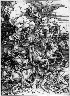
Another Dürer. The Horsemen of the Apocalypse. I couldn't resist posting this on. This work says far more than any painting could. No further comment from me is needed.

Tuesday, September 05, 2006

Albrecht Dürer was a German artist and a shining star of the Northern Renaissance. His draughtsmanship was absolutely superb. Records show that he spent huge amounts of time drawing. After that he did more drawing and in his spare time did a bit of ....... drawing. The above gives a good insight into what he did; a self portrait, a drawing of one of his hands, a piece of cloth. There were others contemporanious to this period; Martin Schongauer,Albrecht Altorfer to name but two. This was a golden age of draughtsmanship which alas is in my view, underrated. Museums and galleries seem only to want to show paintings and you really have to burrow to find the drawings. Why is this?
This piece, "The Piece of Turf" by Dürer is a finished work in its own right. The detailing is exquisite. Some two years ago the British Museum mountied and exhibition of Dürer's graphic work and I was able tosee some of this work for myself. The photos of it don't do justice to the work.

Monday, September 04, 2006

The boundaries between painting and drawing can get a bit blurred at times. I want to show this image from my current sketckbook of the rolling Atlantic. I drew it conventionally enough with a 4B and 2B pencil but then added a watercolour wash but used seawater instead. What we have here, with the original at any rate, is a picture of the Atlantic ocean but incorporating the waters of the Atlantic too.
Unlike when I have used water and added salt as seen on my Sept. 2 posting, sea water when it dries clumps the pigment but in a more even way.
Not so sure what the long term implications are here. Will the sea water eventually degrade the paper or for that matter, my brushes? We'll just have to wait and see.

Sunday, September 03, 2006

Two studies of the waves. This first one done exclusively in dry media: 3B pencil in fact. I did about four of these letterbox shaped drawings on a single piece of A4. Again it is a view from the clifftop of the sea long before it turns into churning foam and breakers on the shore.

This next one is a look at how it turns out using varied media. Reading from the left it is in soft graphite, 3B pencil, then a thin watercolour wash and finally 50-50 application of wash and drawing.

Saturday, September 02, 2006


The sea at Tintagel in Cornwall.An almost overhead view seeing I was on top of a 600 foot cliff at the time. It is an intersting viewpoint nonetheless. From this height one can see the general ebb and flow of the sea and the patterns the waves make. Its "seeing the bigger picture" as it were.
Before i went to Tintagel I prepainted some of the pages in my sketchbook; I do and abstract wash then sprinkle salt on it while the page is still wet. The salt mops up some of the pigment and when dry, leaves a random pattern and some rough texture on the paper. I then draw over this later on. The only concsious decision is to draw the sea on a blue page. This image is A4 size.